Android: 버튼 또는 이미지 버튼의 텍스트와 이미지 결합
버튼에 이미지(배경)를 두고 런타임 중에 발생하는 상황에 따라 이미지 위/위에 텍스트를 동적으로 추가하려고 합니다.
사용할 경우ImageButton저는 심지어 텍스트를 추가할 수 있는 가능성도 없습니다.사용할 경우Button할 수 는 텍트를추수있이때정만의할를미지스만지만 사용합니다.android:drawableBottom및 여기에 정의된 것과 유사한 XML 특성.
그러나 이러한 속성은 x차원과 y차원의 텍스트와 이미지만 결합하므로 텍스트 주변에 이미지를 그릴 수 있지만 텍스트 아래/아래에는 그릴 수 없습니다(디스플레이에서 나오는 것으로 정의된 z축).
이것을 어떻게 할 것인지에 대한 제안이 있습니까?한 가지 아이디어는 두 가지 중 하나를 확장하는 것입니다.Button또는ImageButton그리고 그것을 무시합니다.draw() -네그러나 현재의 지식 수준으로는 이 작업(2D 렌더링)을 수행하는 방법을 잘 알지 못합니다.아마도 더 많은 경험을 가진 사람이 시작할 수 있는 해결책이나 최소한 몇 가지 조언을 알고 있을까요?
배경, 아이콘 이미지 및 텍스트를 하나로 통합하려는 사용자용 Button다른 파일에서:설정Button배경, 그리기 가능한 위쪽/아래쪽/오른쪽/왼쪽 및 패딩 특성.
<Button
        android:layout_width="wrap_content"
        android:layout_height="wrap_content"
        android:background="@drawable/home_btn_test"
        android:drawableTop="@drawable/home_icon_test"
        android:textColor="#FFFFFF"
        android:id="@+id/ButtonTest"
        android:paddingTop="32sp"
        android:drawablePadding="-15sp"
        android:text="this is text"></Button>
보다 정교한 배치를 위해 사용할 수도 있습니다.RelativeLayout(또는 다른 레이아웃)을 클릭할 수 있도록 설정합니다.
자습서:두 사례를 모두 다루는 훌륭한 튜토리얼: http://izvornikod.com/Blog/tabid/82/EntryId/8/Creating-Android-button-with-image-and-text-using-relative-layout.aspx
이 문제에 대한 훨씬 더 나은 해결책이 있습니다.
.Button다음을 사용합니다.drawableLeft 리고그고.gravity특성.
<Button
  android:layout_width="fill_parent"
  android:layout_height="wrap_content"
  android:drawableLeft="@drawable/my_btn_icon"
  android:gravity="left|center_vertical" />
이렇게 하면 버튼 왼쪽에 아이콘이 표시되고 아이콘 오른쪽에 텍스트가 세로로 가운데에 표시되는 버튼이 나타납니다.
전화할 수 있습니다.setBackground()에서.Button버튼의 배경을 설정합니다.
모든 텍스트가 배경 위에 나타납니다.
다음과 것이 있습니다: xml과 유사한 것이 있습니다.android:background동일한 방식으로 작동하는 속성.
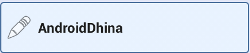
     <Button
            android:layout_width="0dp"
            android:layout_weight="1"
            android:background="@drawable/home_button"
            android:drawableLeft="@android:drawable/ic_menu_edit"
            android:drawablePadding="6dp"
            android:gravity="left|center"
            android:height="60dp"
            android:padding="6dp"
            android:text="AndroidDhina"
            android:textColor="#000"
            android:textStyle="bold" />
선형 레이아웃을 사용하여 다음과 같이 가정합니다.Button 팅세background클릭할 수 있다는 것이 핵심입니다.
<LinearLayout
    android:id="@+id/button"
    android:layout_width="wrap_content"
    android:layout_height="wrap_content"
    android:background="@android:drawable/btn_default"
    android:clickable="true"
    android:orientation="horizontal" >

    <ImageView
        android:id="@+id/img"
        android:layout_width="wrap_content"
        android:layout_height="wrap_content"
        android:layout_gravity="center_vertical"
        android:layout_marginLeft="5dp"
        android:src="@drawable/image" />

    <TextView
        android:id="@+id/textView2"
        android:layout_width="wrap_content"
        android:layout_height="wrap_content"
        android:layout_gravity="center_vertical"
        android:layout_margin="5dp"
        android:text="Do stuff" />
</LinearLayout>
그냥 대체합니다.
android:background="@drawable/icon"
와 함께
android:background="@android:color/transparent"
android:drawableTop="@drawable/[your background image here]"
나는 꽤 좋은 속임수를 씁니다.;)
저는 여기에 나와 있는 것들과는 다른 접근 방식을 취했고, 그것은 정말 잘 작동하고 있어서 공유하고 싶었습니다.
스타일을 사용하여 이미지가 왼쪽에 있고 텍스트가 오른쪽 가운데에 있는 사용자 지정 단추를 만들고 있습니다.아래의 4가지 "쉬운 단계"를 따르십시오.
I. 3개 이상의 서로 다른 PNG 파일과 /YOUR_에 있는 도구를 사용하여 9개의 패치를 생성합니다.OWN_PATH/android-sdk-mac_x86/tools///draw9 패치입니다.이 후에는 다음 작업을 수행해야 합니다.
button_noral.9.png, button_focused.9.png 및 button_pressed.9.png
그런 다음 24x24 PNG 아이콘을 다운로드하거나 만듭니다.
ic_your_icon.png
Android 프로젝트의 그리기/폴더에 모두 저장합니다.
II. drawable/폴더 아래 프로젝트에 button_selector.xml이라는 XML 파일을 만듭니다.상태는 다음과 같아야 합니다.
<item android:state_pressed="true" android:drawable="@drawable/button_pressed" />
<item android:state_focused="true" android:drawable="@drawable/button_focused" />
<item android:drawable="@drawable/button_normal" />
III. values/폴더로 이동하여 styles.xml 파일을 열거나 생성하고 다음 XML 코드를 생성합니다.
<style name="ButtonNormalText" parent="@android:style/Widget.Button">
    <item name="android:textColor" >@color/black</item>
    <item name="android:textSize" >12dip</item>
    <item name="android:textStyle" >bold</item>
    <item name="android:height" >44dip</item>
    <item name="android:background" >@drawable/button_selector</item>
    <item name="android:focusable" >true</item>
    <item name="android:clickable" >true</item>
</style>

<style name="ButtonNormalTextWithIcon" parent="ButtonNormalText">
    <item name="android:drawableLeft" >@drawable/ic_your_icon</item>
</style>
ButtonNormalTextWithIcon은 ButtonNormalText("부모 스타일")를 확장하므로 "하위 스타일"입니다.
버튼에서 그리기 가능한 왼쪽 일반 텍스트 아이콘 스타일을 그리기 가능한 오른쪽, 그리기 가능한 스타일로 변경합니다.맨 위 또는 그릴 수 있는 맨 아래 텍스트에 대한 다른 위치에 아이콘을 배치할 수 있습니다.
IV. UI에 대한 XML이 있는 레이아웃/폴더로 이동하고 스타일을 적용할 버튼으로 이동하여 다음과 같이 만듭니다.
<Button android:id="@+id/buttonSubmit"
android:text="@string/button_submit"
android:layout_width="fill_parent"
android:layout_height="wrap_content"
style="@style/ButtonNormalTextWithIcon" ></Button>
그리고... voila!왼쪽에 이미지가 있는 버튼이 있습니다.
이렇게 하면 표시할 아이콘과 별도로 버튼의 텍스트 크기를 관리하고 스타일을 사용하여 Android UI 가이드라인과 관련된 여러 아이콘의 동일한 배경 그림을 사용할 수 있기 때문입니다.
또한 앱에 대한 테마를 만들고 모든 버튼이 동일하게 보이도록 "상위 스타일"을 추가하고 필요한 위치에만 아이콘이 있는 "하위 스타일"을 적용할 수 있습니다.
중요 업데이트
일반적인 .
android:drawableLeft벡터 드로잉 가능한 등... 그렇지 않으면 하위 API 버전에서 충돌합니다.(라이브 앱에서 마주한 적이 있습니다)
벡터 그리기 가능한 경우
벡터 그리기 가능을 사용하는 경우 다음과 같이 해야 합니다.
- AndroidX로 마이그레이션하셨습니까? 그렇지 않으면 먼저 AndroidX로 마이그레이션해야 합니다.매우 간단합니다. Androidx란 무엇이며 마이그레이션 방법을 확인하십시오.
버전으로 출시되었으므로 appcompat 버전은 최소한이어야 합니다.
1.1.0-alpha01은 현재최버전입니다.1.1.0-alpha02최신 버전을 사용하여 안정성을 향상시키십시오. 릴리스 정보 - 링크를 참조하십시오.implementation 'androidx.appcompat:appcompat:1.1.0-alpha02'사용하다
AppCompatTextView/AppCompatButton/AppCompatEditText- 사용하다
app:drawableLeftCompat,app:drawableTopCompat,app:drawableRightCompat,app:drawableBottomCompat,app:drawableStartCompat그리고.app:drawableEndCompat
일반 추첨용
벡터 그리기가 필요하지 않으면 다음과 같이 할 수 있습니다.
- 사용하다
android:drawableLeft,android:drawableRight,android:drawableBottom,android:drawableTop - 일반적으로 사용할 수 있습니다.
TextView,Button&EditText또는AppCompat반.
아래와 같은 출력을 얻을 수 있습니다.
 <Button android:id="@+id/imeageTextBtn"
        android:layout_width="240dip"
        android:layout_height="wrap_content"
        android:text="Side Icon With Text Button"
        android:textSize="20sp"
        android:drawableLeft="@drawable/left_side_icon"
        />
사용할 수 있습니다.drawableTop(또한)drawableLeft등)에 대해 이미지를 추가하고 이미지 아래에 텍스트를 설정합니다.gravity left|center_vertical
<Button
            android:id="@+id/btn_video"
            android:layout_width="wrap_content"
            android:layout_height="wrap_content"
            android:layout_alignParentRight="true"
            android:layout_centerVertical="true"
            android:background="@null"
            android:drawableTop="@drawable/videos"
            android:gravity="left|center_vertical"
            android:onClick="onClickFragment"
            android:text="Videos"
            android:textColor="@color/white" />
재료 단추는 아이콘을 설정하고 텍스트에 정렬할 수 있습니다.
<com.google.android.material.button.MaterialButton
        android:layout_width="wrap_content"
        android:layout_height="wrap_content"
        android:text="My button"
        app:icon="@drawable/your_icon"
        app:iconGravity="textStart"
        />
app:iconGravity할 수도 있습니다.start/end아이콘을 단추 안에 있는 텍스트 대신 단추에 맞추려면 이 옵션을 클릭합니다.
버전 1.5.0-beta01 이후,app:iconGravity될 수도 있습니다.top/textTop(커밋)

<Button
     android:id="@+id/groups_button_bg"
     android:layout_height="wrap_content"
     android:layout_width="wrap_content"
     android:text="Groups"
     android:drawableTop="@drawable/[image]" />


android:drawableLeft
android:drawableRight
android:drawableBottom
android:drawableTop
http://www.mokasocial.com/2010/04/create-a-button-with-an-image-and-text-android/
아마 제 솔루션이 많은 사용자에게 적합할 것입니다. 그러길 바랍니다.
제가 제안하는 것은 당신의 스타일로 TextView를 만드는 것입니다.그것은 나에게 완벽하게 작동하고 버튼과 같은 모든 기능을 가지고 있습니다.
우선 어디서나 사용할 수 있는 버튼 스타일을 만들자...button_with_hover.xml을 만들고 있습니다.
    <?xml version="1.0" encoding="utf-8"?>
<selector xmlns:android="http://schemas.android.com/apk/res/android">
    <item android:state_pressed="true" >
        <shape android:shape="rectangle"  >
            <corners android:radius="3dip" />
            <stroke android:width="1dip" android:color="#8dbab3" />
            <gradient android:angle="-90" android:startColor="#48608F" android:endColor="#48608F"  />
        </shape>

        <!--#284682;-->
        <!--border-color: #223b6f;-->
    </item>
    <item android:state_focused="true">
        <shape android:shape="rectangle"  >
            <corners android:radius="3dip" />
            <stroke android:width="1dip" android:color="#284682" />
            <solid android:color="#284682"/>
        </shape>
    </item>
    <item >
        <shape android:shape="rectangle"  >
            <corners android:radius="3dip" />
            <stroke android:width="1dip" android:color="@color/ControlColors" />
            <gradient android:angle="-90" android:startColor="@color/ControlColors" android:endColor="@color/ControlColors" />
        </shape>
    </item>

</selector>
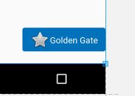
두 번째로 텍스트 보기 단추를 만들 수 있습니다.
    <TextView
    android:layout_width="wrap_content"
    android:layout_height="wrap_content"
    android:layout_marginBottom="20dip"
    android:layout_gravity="right|bottom"
    android:gravity="center"
    android:padding="12dip"
    android:background="@drawable/button_with_hover"
    android:clickable="true"
    android:drawableLeft="@android:drawable/btn_star_big_off"
    android:textColor="#ffffffff"
    android:text="Golden Gate" />
그리고 이것은 결과입니다.그런 다음 사용자 지정 단추에 색상이나 기타 속성 및 여백을 지정합니다.행운을 빌어요
이 코드는 나에게 완벽하게 맞습니다.
<LinearLayout
    android:id="@+id/choosePhotosView"
    android:layout_width="match_parent"
    android:layout_height="wrap_content"
    android:orientation="horizontal"
    android:gravity="center"
    android:clickable="true"
    android:background="@drawable/transparent_button_bg_rev_selector">

    <ImageView
        android:layout_width="wrap_content"
        android:layout_height="wrap_content"
        android:src="@drawable/choose_photo"/>

     <TextView
        android:layout_width="wrap_content"
        android:layout_height="wrap_content"
        android:textColor="@android:color/white"
        android:text="@string/choose_photos_tv"/>

</LinearLayout>
결합하기Button그리고.drawableTop그리고 여전히 클릭 응답을 받습니다, 당신은 버튼 스타일을 사용할 수 있습니다.@style/Widget.AppCompat.Button.Borderless투명하게 하기 위해서입니다.
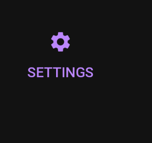
<Button
    android:id="@+id/settings"
    style="@style/Widget.AppCompat.Button.Borderless"
    android:layout_width="wrap_content"
    android:layout_height="wrap_content"
    android:drawableTop="@drawable/ic_baseline_settings_24"
    android:drawableTint="?attr/colorPrimary"
    android:text="@string/settings"
    android:textColor="?attr/colorPrimary" />
<Button android:id="@+id/myButton"
    android:layout_width="150dp"
    android:layout_height="wrap_content"
    android:text="Image Button"
    android:drawableTop="@drawable/myimage"
    />
또는 프로그래밍 방식으로 다음을 수행할 수 있습니다.
Drawable drawable = getResources.getDrawable(R.drawable.myimage);
drawable.setBounds(0, 0, 60, 60);
myButton.setCompoundDrawables(null, drawable, null, null);//to the Top of the Button
다음을 사용할 수 있습니다.
  <Button
                    android:id="@+id/reset_all"
                    android:layout_width="wrap_content"
                    android:layout_height="wrap_content"
                    android:layout_marginRight="5dp"
                    android:layout_weight="1"
                    android:background="@drawable/btn_med"
                    android:text="Reset all"
                    android:textColor="#ffffff" />

                <Button
                    android:id="@+id/undo"
                    android:layout_width="wrap_content"
                    android:layout_height="wrap_content"
                    android:layout_marginLeft="5dp"
                    android:layout_weight="1"
                    android:background="@drawable/btn_med"
                    android:text="Undo"
                    android:textColor="#ffffff" />
제가 이미지를 넣었다는 점에서.background그리고 텍스트도 추가했습니다...!
가짜 단추를 만듭니다.
그게 정말 유일한 방법입니다.
  <FrameLayout
        android:id="@+id/fake_button"

        android:layout_width=" .. "
        android:layout_height=" .. "

        android:background="@android:color/transparent"

        android:clickable="true"
        android:onClick="tappedNext">

        <ImageView
            android:id="@+id/fake_image"
            android:layout_width="match_parent"
            android:layout_height="match_parent"

            android:src="@drawable/your_amazing_drawable" />

        <TextView
            android:id="@+id/fake_text"
            android:layout_width="match_parent"
            android:layout_height="match_parent"
            android:gravity="center"

            android:text="Next"
            android:fontFamily="@font/ .. "
            android:textColor="@color/ .. "
            android:textSize=" .. " />
    </FrameLayout>
    <ImageView
        android:id="@+id/iv"
        android:layout_width="match_parent"
        android:layout_height="match_parent"
        android:scaleType="centerCrop"
        android:src="@drawable/temp"
        />
언급URL : https://stackoverflow.com/questions/1532876/android-combining-text-image-on-a-button-or-imagebutton
'programing' 카테고리의 다른 글
| Python 문자열이 [u'String']으로 인쇄됨 (0) | 2023.07.11 |
|---|---|
| C와 C++ # include 디렉티브에서 백슬래시를 사용할 수 있습니까? (0) | 2023.07.06 |
| redistrepect_cast의 C에 해당하는 것은 무엇입니까? (0) | 2023.07.06 |
| Flask dev 서버를 실행하는 이유는 무엇입니까? (0) | 2023.07.06 |
| 스프링 부트 구성 요소스캔 제외제외하지 않는 필터 (0) | 2023.07.06 |